How to Validate and Calibrate your Sprint Plan with Burndown Charts
If you make a search for the term "burn down chart", you are presented with more than a million results on that subject. Wikipedia defines it as a graphical representation of work left to do versus time, but for me it is much more than that. Burndown charts can be used on sprint and release levels to give a great deal of information in a very compact format.
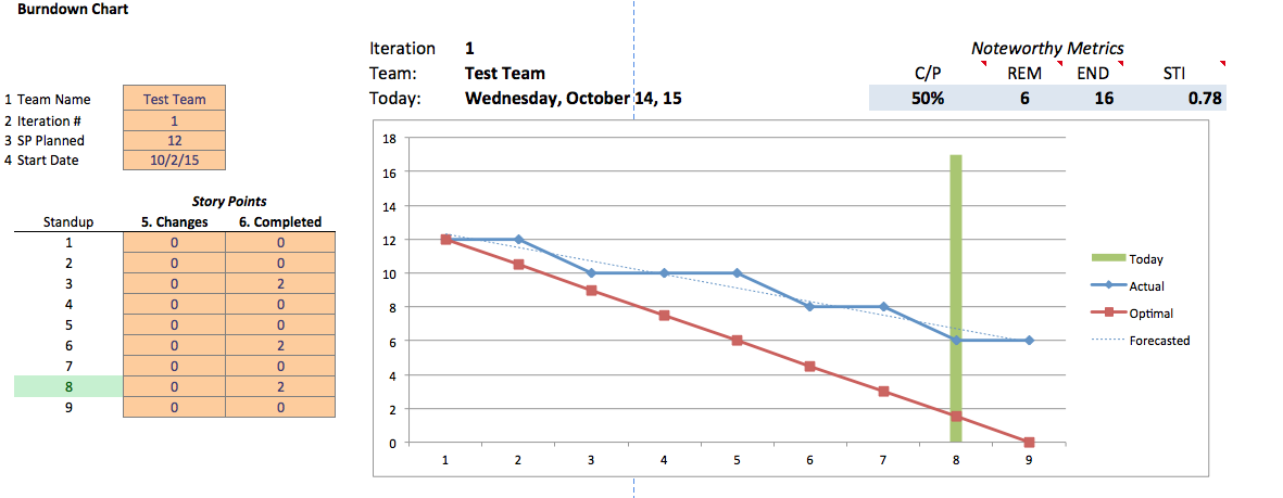
While some agilists prefer to plot hours of work versus iteration days, I strongly support plotting story point vs iteration days, given that the business value is realized when stories are completed and not by how many hours it took to get there and as a bonus, that is the unit used in agile planning.
Recently I was attending a meeting with a Product Owner (PO) and the PO said that seeing a burndown in action during the daily standup, was worth more than a thousand words, and I totally agree. A good burndown, used properly and transparently gives the team a tremendous insight into their current plan and how it compares to their best estimate. It allows the team to have a better conversation on the risks and steps needed to make it to the finish line.
Ok so what is a good burndown chart look like?
- It is in a form that takes the least amount of time to fill and maintain.
- Uses story points vs sprint day.
- Shows which day you are in the sprint.
- Maintained daily!
How to use and read a burndown chart?
- Look at the actual work burn down, compared to the best estimate.
- Examine the emerging pattern every day.
- Inspect and address the reasons for deviating from best estimate.
- Ask yourself, is there an impediment and we failed to raise?
- Always try to hug the best estimate line.
- Take action as soon as possible! Each day waiting is equivalent to 10% of your plan (in a 2 week sprint).
How can Agile Stream metrics help your burndown become even better?
I usually like to see two metrics shown on a burndown chart that provide team with insight on what could happen if things are not adressed ASAP. These metrics, provide an empirical mirror shining back at the conversation happening within the team. These metrics are:
- Forecasted End Date - this is a forecasted estimate of the end date for the current sprint based on the current story burndown. (In the graph it is shown as END)
- Stream Turbulence Index (STI) - is an forecasted estimate of uncertainty, in sprint multiples, based on current story burndown. Whereas numbers closer to zero denote less uncertainty and increase proportionally.
Hope this excerpt will help you take advantage of what burndown charts offer. I am making a copy of the excel sheet above available for you to use with your teams. If you have questions, please reach out on twitter @AgileStream
Mobile Site

Contact Us
Stay Connected
Copyright © 2013 - Agile Stream Framework, 131 Daniel Webster Hwy #712, , Nashua, NH 03060 , USA. P:(844) 842-2488 Powered by Ayna | Manage